Photographing Art
Photographing Art
WARNING: THIS ESSAY IS AN EXPLORATION. DON'T GET ON YOUR HN AND LOBSTERS TALKING ABOUT HOW I KNOW NOTHING ABOUT PHOTOGRAPHY BECAUSE YOU WOULD BE RIGHT AND THAT'S WHY I'M WRITING THIS.
Photographing art turns out to be very difficult. You would think that you could just point a camera on your phone at a piece of art and it would come out correct. In fact if you're at a museum it might actually work because the museum controls the light that is on every painting. In my house though I do not have high quality museum lights. What I have are crappy, yellow, florescent, warm, and plain terrible lighting. So when I take a photo of my paintings it usually comes out looking kind of like I took the photo under a streetlamp.
The problem is that the quality of light impacts the way the painting looks, but you can't just get better lights and suddenly improve the quality of your painting photos. Cameras actually do quite a lot to try to "correct" photos when you take them. A camera will attempt to adjust the level of yellow versus blue in your photo, change the amount of light versus dark, and several other things that generally help when photographing things outside, but don't help when photographing a piece of art.
This problem actually drove me insane for quite a while, so I decided to try to figure out what's going on and fix it. I found that you can actually fix a lot of the problems with lights and color, but that you can't actually fix it to a point where the artist who did the painting will agree that it's correct. Even if I've solved the majority of my problems with art photography, other painters will have slightly different perceptions that will make it different for them. I'll take a photo that has perfectly calibrated color, light/dark balance, and just about everything looks great to me but to them it's still wrong. Human perception is weird like that.
So as you read this keep in mind that this is just what I found makes the paintings look better for me when I photograph them. Also keep in mind that I am super lazy and I actually don't do most of this stuff every single time I take a photo of my paintings. Many times I just whip out my best camera point and shoot and go, "yeah that's good enough."
However, pretty soon I'm going to be taking more serious photos of my artwork for posting to a new project. That means I have to become more formal about how I photograph my artwork, in this blog post is my attempt to write this down and collect information.
Research
There is almost no easily found literature on the subject of photographing art, so I had to learn most of it myself. You can find books and courses on photographing just about anything want. There are books on photographing landscapes, houses, portraits, nudes, rocks, cars, and almost everything except for artwork. The only resources that I could find on photographing paintings are from painters. The problem with this is the majority of painters are not professional photographers, so their advice tends to just be what works for them for a few times or keeps working for them.
What's worse is the majority of photographers simply use Photoshop to correct all of the problems that they run into. Rather than try to take a photo correctly the first time, a photographer will simply take a whole bunch of photos and then fix them all up in Photoshop from memory. For most things this works because a photographer isn't really trying to record reality, but to create a pleasing artistic image so they have a lot of freedom to alter photos to be "better". When photographing artwork (or any forensic photography), your ideas of artistic integrity do not belong. You're trying to record as exactly as possible what is photographed.
This means the majority of the advice on how to fix a photo in Photoshop is useless. When you photograph a painting you have to control the lights, how it bounces off the painting, and get the color correct in the original photo while you are looking at the painting. To do that you have to actually calibrate the camera to the light source and use a camera and lens that solves some of the problems.
The Issues to Overcome
The following are the main problems I had when taking photos of my paintings. These aren't all of the issues but they're the ones that seem to be the hardest to solve with just Photoshop.
Light Color
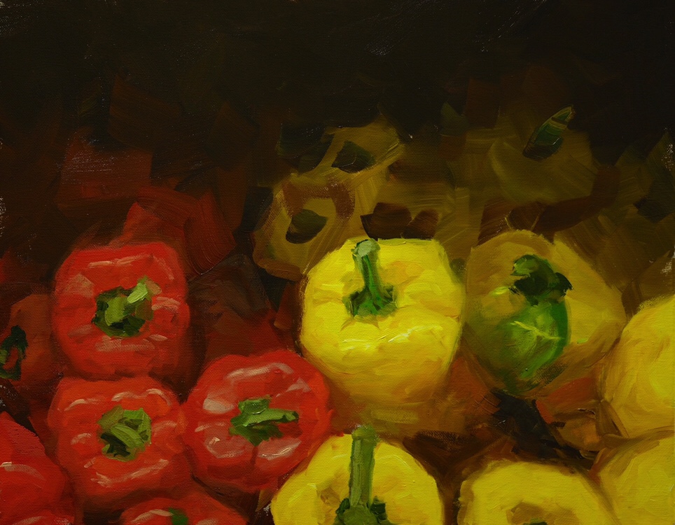
Light color is best demonstrated by these two photos:
Compared to this one:
The first photo was taken without any correction to the color of the light (and bad focus on the top). The second photo was taken after correcting the camera's color settings to more accurately reflect what I saw as more accurate. The reason the first one isn't right is that the camera was set to Auto White Balance mode, and I guess it thought the photo was too yellow so it removed the yellow (especially in the whites). Problem is, I painted that sky as much more yellow, so it was wrong. Now, maybe the first one is more appealing, but it's not accurate.
I'll explain later how I do this, but the general idea is you can calibrate your camera so that it knows that the light is set to a certain color temperature and then it will compensate so that the actual picture taken is correct.
Another thing that causes this is the temperature of the lights. If you get a light that has a low temperature, say 3500 K, then that means it has more yellow in it and possibly red and less blue and the color. If you get a light that has a higher temperature, say 5500 K, then that means it has a lot less yellow in the light and much more blue. In most houses people pick lights that have a warm temperature in the 3000 to 3500 K range. But when you observe a painting you want to use the most neutral light, or maybe a much cooler light closer to the 5000 K range. If you use a light that has two cool of a temperature then the painting may look very harsh and not as colorful.
Chances are I did this painting under a yellow light, saw the painting as yellow, and then tried to "fix" the camera's AWB correction. Now we get into the weird world of human perception because I bet if I moved the painting over to a cooler light I'd want to take a new photo. If I showed the painting to another human with slightly different genetics in their eyes they would see the painting just a little different and want to adjust it too. The end result is you can never really get a photo of a painting perfectly accurate so that everyone looking at it in every kind of light will say it's "correct". You just have to get close.
That means you can't actually find a light that will perfectly render your painting. I have tried nearly every kind of light at every temperature in every possible way, and there just doesn't exist the light that will make your painting look good with your camera set at its default or for every person. The reason is your camera's default is to use something called auto white balance. Auto white balance will take any photo you take and try to balance all of the light temperature in the photo so that it is more even. Normally this works great when you're taking photos in sunlight or outside or even interior light. But when you have to photograph a painting, you need to control the exact setting for the cameras color temperature or else it will shift the painting in strange ways to compensate for any light you use.
That means you need to calibrate your camera and tell it what the temperature of the light is. I'll explain how I do this later after I talk about all the things that I tried first.
Reflections and Specular Highlights
When you photograph a piece of artwork that is glossy you have a problem with reflections in any area that is black, and specular highlights in any ridges of the gloss. Reflection happens because when you have a glossy pure black surface it actually acts as a mirror. In fact this is called a black mirror. Specular highlights happen because, when you use oil paint, there are actual ridges and surface textures that hit the light at the right angle relative to the camera that cause a pure white light bright spot.
When you study painting you'll see all these diagrams about where the highlights are on spheres and many of the diagrams are wrong because they just make it seem like the only factor is the position of the light relative to the shiny object. The actual cause of specular highlights and their position is based on the location your eye relative to the location of the light and the location of the object. If an object is shiny, and you move around, you'll see the specular highlight move. There are a lot of ways to reduce the reflection on a glossy painting surface, but probably the best is to just use a zoom lens and get really far away, then move the lights so the highlights disappear.
Light and Dark Exposure
Cameras work very similar to your eye. When they look into a dark area they adapt so that they can take an accurate picture of the dark area. But to do this they need to change various mechanisms in the camera so that way they can receive more light from the dark area. What that does is it receives too much light from the light areas of the painting and causes a blown out light area. Your eye also does this, but you don't really notice it as much. The inverse is also true. When the camera focuses on a very light part of the painting it has to change mechanisms internally to reduce the amount of light it's receiving, which then makes all of the dark areas very dark.
This isn't something that's specific to cameras, as your eyes also do the exact same thing. It's more a symptom of using a lens system with an aperture to focus light. The only solution is to simply take multiple photos exposed at different levels so that you can capture the information in the light and dark areas equally. With exposures at different levels you can then merge them in photoshop to create an image with information in the light and dark parts of the painting.
General Image Quality
Something I am very terrible at is taking photos without a tripod. In general you'll have image quality issues related to camera shake. If you are in a room that is dimly lit, then your camera will have to increase the ISO rating in order to get an image that is visible. The problem is that this higher ISO results in pixelation. So the only solution is to either get a better light, or increase the exposure time for the camera. If you combined this problem with the previous problem, then you end up needing a tripod to keep the camera stable. If you want to have very low ISO images, and use dimmer lights so you don't get insane highlights and reflections, and you need to take a range of exposures so that you can capture lights and darks, then you have to use a tripod.
You'll see in the next problem though that I typically just take a random photo pretty quick and throw it up because most of the services where I post my photos mangle the crap out of them anyway. I'm going to be retaking many of these photos in the near future, so I'll be able to demonstrate my full set up.
To put it bluntly, Instagram is a terrible place to post photos of art. In addition to their strange censorship of anything with a nipple, they also stomp on your paintings in very strange ways. Many times they try to "improve" your photos by altering the colors for no reason. For the majority of Instagram's life you couldn't even use something that wasn't square.
Even now that you can use different aspect ratios, it still has problems. Instagram's default cropping will still crop images that are vertical formats of very common painting aspect ratios. It's almost as if they simply went and tested two images from a 35mm camera and then forgot about 2000 years of painting history or all medium format cameras and beyond. Ironically, Instagram is based on medium format cameras which also have the same cropping issue when you use the wider formats vertically.
Instagram isn't the only problematic service. If you post a photo of a painting with a heavy weave in the canvas, then Twitter will compress it such that people can see the weave. Even if the original image barely shows that weave, something about Twitter's compression algorithm exposes the weave in the image.
There really is no solution to this, other than to take photos and then modify them before you post on Instagram.
Matte vs. Gloss
One final thing to note is that a lot of these problems don't exist in any matte medium. These are paintings that are done in watercolor, gouache, or pastel. These paintings don't have problems with reflections and specular highlights. They also seem to photograph better in different light temperatures. And they don't have as many problems with dark and light exposure as many times they tend to be lighter mediums. You still have problems with color, but that is a constant problem with all photos of art.
Things That Don't Work
Let's go through some things that simply don't work now that we know the general problems you face when photographing a glossy painting. I gathered most of this advice from random blogs, books, and other artists. I imagine there's someone out there who is a forensic photographer and knows how to solve all these problems using these techniques, but I couldn't get a single good-looking photo of my paintings to save my life doing these.
Image Quality
The first advice on image quality was to just use the noise reduction features of light room. You were told to take a painting, photo it, pop it in the light room, and then just play with the clarity and dehazing sliders. This doesn't work because it's kind of a garbage in garbage out situation. If you have a low quality image to start with that has a lot of noise, then most of the things you do to try and fix it simply make it worse. I'm sure there's someone who is a Photoshop whiz that can solve these problems in Photoshop, but if you just take a better photo start with you don't have to do as much.
Another suggestion in the opposite direction was to use very strong cool lights. The problem I had with these very strong cool lights was that they caused reflections and they made paintings look really weird and blue. I ended up having to load them in Photoshop or light room and still modify them a lot. Again if I just take a better photo to begin with I don't have to do as much to fix it.
Other ideas I had were to use filters to control the lights, to bounce light off different surfaces, and to use different kinds of flashes. None of these things really work to fix the painting. The only thing that worked was use a good quality zoom lens, get really far back, and use a tripod.
Color Correction
Most painters solve the color correction problem by taking a photo and then again fixing it in Photoshop. They have the advantage that they have the painting right in front of them so they can keep twiddling the photo until it matches what they think the painting looks like. The problem with this is that if they are fixing the photo on their computer and looking at the painting under the same crappy light, then they're just going to correct the photo to match the crappy light.
The worst suggestion I had was to take photos of the paintings outside in bright sunlight but under a shadow of the building. There's even a hilarious photo of the painter with the painting propped up on her feet against the wall and the camera on her knees. I imagine the reason that this might work where she lives is that when you are in the shadow of the building the majority of your light tends to be very cool as it comes from the sky rather than the sun. But, she probably didn't get a very good ISO setting on the image because there isn't enough light. She also wasn't using a tripod.
The next suggestion was to use a device called a spider checker, or a color reference card. The color reference card is a block of color squares that are set to standard calibration. You put this next your photo in the exact same light, take your photo, and then, when loaded into Lightroom or Photoshop, you can run a tool that fixes the color according to the reference chart. This tool looks at your photo and each of the squares, then compares it to what it knows those squares should be inside its software. This would have worked pretty well, except to the majority of the software that does color correction is total garbage. I believe they write all the software in Adobe Flash, and it crashes on every third photo I would take.
Another solution that I tried is to use a color correction cube. This is a little cube with a light side a dark side and a gray side. You put this next year painting and take a photo like normal, and then you simply go in light room or Photoshop and click on the light side of the cube, the gray side of the cube, and the dark part of the cube setting each of the different light point, black point, and neutral gray settings of light room. This works okay, and is a lot cheaper than the color correction grid, but I found an even better solution later on that I now use.
Specular Highlights
Since I'm fairly lazy when I take my photos of paintings you can usually see specular highlights in them. But when I'm serious about it I try to remove the specular highlights. As I mentioned before it doesn't matter what light you use, because any light will reflect off of the painting if it's glossy enough.
The first solution proposed to me was to simply use a non-glossy varnish. But this actually makes the dark parts of your painting look dull and gray. The other problem is that I am impatient and I want to take my photo right now because I'm excited I just finished this painting. How else am I going to get 20 likes on Instagram?!
The next solution was to bounce the light off of a soft surface like an umbrella and then on to the painting. The problem with bouncing the light is again it seemed like it didn't matter what I used I still got some kind of reflection or highlight. Also because the light is bounced off of a soft surface it is not as strong. So I either needed five or six lights, or crazy strong lights, both of which then just created more sources for reflections.
The other solution that I still use for the very difficult highlights, is to simply find them in Photoshop and remove them. As long as there's only a few here and there I don't mind this. You just use the healing tool to have each one removed and try to keep the spot as small as possible so you don't alter the actual look of the painting. However, this becomes impossible when there is a lot of highlights or it's a reflection. I also feel like this should just be a feature of light room. These highlights are almost always absolutely pure white, and I should just be able to go in and pick a color range and say remove all the dots like this and it will do it.
Light and Dark Balance
I tried quite a few random things to solve this problem, but most of them involve using some form of HDR. This is where you take a whole bunch of photos of different exposures. Some on the light range, middle range, and dark range, of the scene. Then that you merge them either manually or with software. Doing this you can probably produce the most balanced and accurate representation of the scene since you get full information for both the light and dark parts of the painting. I found this to be a big problem because it tended to make the light parts too dark and the dark parts too light. This technique works great for landscape photos and other photos of real life things, but doesn't work so well for paintings.
Another suggestion was to simply not paint paintings that were too light or too dark. I mostly try to do this, but this means that all of your paintings end up right in the middle range and there's no drama to them. The second you try to add some higher contrast elements you then have to fix this problem in your photos.
Things That Do Work
Now that I've cover the things that do not work, let's go through the things I use now which actually do work. Keep in mind that I'm not a professional photographer. These recommendations are all from studying and experimenting with how to take better photos of paintings. A lot of this advice is fairly straightforward if you're a photographer.
Image Quality
If you want to improve image quality then you have to use a tripod. You can get pretty good stability with some of the image stabilization systems in cameras today, but nothing beats a good solid tripod. With a tripod you can also take multiple exposures of your painting to select the best one or merge them together.
The next thing you want to do is force the ISO setting in your camera to 100 or less. Every camera today is able to force the ISO to a specific setting even if you're using an automated mode. When you force the ISO to a specific setting the camera will adjust how long the exposure is and that's why you need the tripod. If you have a very dimly lit room, then to get 100 ISO the camera needs to have perfect stability and a very long exposure time.
Finally you need to reduce all camera shake during these longer exposures. The best way to do that is to either use a delay of 2 seconds or 10 seconds before the camera takes the photo. Or, use a camera remote to actually take the picture.
With these three things you then have a photo that is very in focus, has no camera shake, and a very low ISO so that there is no noise.
Another thing I have toyed with is shooting with RAW format. Nearly every professional photographer says you have to shoot raw in order to be able to have a good image that you can work with, but I find that processing a raw file is so difficult, and that cameras do such a good job of their JPEG rendering, that I really don't need to use RAW. Another way to put this is, I'm sure if I was better with Photoshop and Lightroom that I could take a raw image and make it way better than the JPEG coming out of the camera but in general every time I've tried to process RAW myself I don't do any better than what the camera does.
I believe this is because cameras have become much better at knowing exactly how their lenses and their sensors work. In the past I think maybe cameras were terrible at compensating for lens defects and sensor bias, so everyone thought they had to shoot RAW. Now I think this is less of a problem, and the only time I really need the RAW as if I plan on doing some very very high quality printing. In that case I need the RAW mostly so I have no image artifacts from the JPEG compression and can compensate for the printer's inks. Otherwise the JPEG is more than enough quality for the majority of my posting online and my own reference.
What I would rather do instead of using raw format is have my camera take many exposures in JPEG with RAW backup. Then when I get home I can look at the different exposures in light room and choose the best one, merge it with other ones, and then if I have a problem with a JPEG I can go into one of the RAW files and produce a better one.
In general I say you probably don't need to process in RAW, but having RAW backup is great just in case the JPEG looks like garbage.
Color Correction
Of all the things I've tried for correcting the light color, Expodisk is the best. It works on the premise that you can point your camera at a gray surface, go into your white balance setting, and calibrate the white balance so that this gray surface comes out completely neutral gray. As long as the surface is actually a neutral gray and not reflecting some other color from the area this will work.
What the Expo disc does is go on your lens like a filter so that it filters out 50% of the light coming in making the image completely gray. It doesn't necessarily change the color of the light, it just changes the amount so that it's at a 50% level and an average of everything coming in. Once you do this then you can calibrate your camera either by pointing it at the image you want to take at the light itself, and it will correct based on the actual light that the camera sees. This is so genius I'm not sure why camera makers don't just include this in their cameras by default. I'm pretty sure they could have the sensors they use simply flipped to a 50% gray mode and then they would have a built-in light temperature meter.
If your camera doesn't support setting the white balance compensation manually, then you can use the Expo disc to simply take a photo that is all gray and then compensate within Lightroom. All you do is take the photo, then take all your normal photos, then in Lightroom you tell it that the gray photo is your neutral gray. Once you've done that you tell it to apply that to all your photos and they're fixed like magic.
I did a lot of tests between Expodisk and the color checker grids and found that with the Expo disc it got very very close to the color checker grids. In fact close enough that I couldn't really tell the difference between the two so I just stopped using the color checker grid. Also the Expo disc is way more reliable than a gray card because it is guaranteed to be a complete flat neutral view of the light not influenced by anything from the environment. Sometimes with a gray card there will be something reflecting on the card, say a T-shirt or the grass or a yellow building, and then that influences the color and makes it not the real color of the light around you.
In addition to this the Expo disc is only $44. Color correction cards will run you $250 or more sometimes. This is a small price for something that saves hours and hours of time correcting photos in post.
Specular Highlights

My solution for most of the highlight and reflection problems is to use a zoom lens that gets me far enough back so that the reflections don't really reach the camera lens. This has to be combined with moving either the painting or the light around so that way the angle of light causes any reflections to not match up with the angle of the lens. By getting far enough away I'm able to make that process a lot easier.
I also will still use an umbrella that's soft to bounce the light onto the painting. You get worse specular highlights when use a very strong light pointed directly at the painting. When you use a light bounced off of the soft umbrella you get more diffused highlights.
Another thing I have used but still need to figure out exactly how it works is a circular polarizer. This is a filter that goes on your camera lens, and has a front part that you can turn. The filter is a lot like a pair of sunglasses and what happens is when you turn the polarizer the light that gets reflected off of the painting will get bent or turned away in certain spots. It basically blocks polarized light, or something. Actually I have no idea how this thing works but that is what I read somewhere. This will reduce a lot of reflections and highlights, but it drops the amount of light down and also can mess with the colors. What you have to do is set the polarizer to block the highlights and then you put the Expodisc in front of it to correct the temperature, and then you still have to load it into Lightroom in order to tweak the colors a bit.
You have to do this extra color correction because the polarizer will emphasize greens or blues or other colors depending on how you turn it. While you're trying to use the polarizer to remove reflections you may have to position it such that it emphasizes the greens. That isn't any particular condition of the light temperature, so you end up having to go into light room anyways and change the amount of green to compensate for the polarizer.
Light and Dark Balance

The first thing I'll do if I want to take a photo of the painting with very dark darks and very light lights is to take multiple exposures and merge them. This is fairly complicated and most software that does this ends up doing a terrible job when you're doing it to a painting. Most of the software that does HDR is designed for people who do landscape photography where you want everything to be in the middle range of the color spectrum. When you're taking a photo of a painting that is high contrast, you typically aren't trying to put everything into the middle range but rather trying to represent the high and low of the painting.
Some cameras do a very good job of in-camera HDR. My Sony camera will actually do a decent job of taking three exposures and merging them together. It seems to work well because it doesn't do anything crazy with the three exposures and the merging. When I use HDR software it seems to want to go for the most insane dramatic merging possible.
What I use the most is Dynamic Range Optimization or DRO. DRO combined with good light from far away will typically be able to render the lights and darks fairly well and balance the amount of exposure within the whole painting. I think the reason that DRO works better is that it's not trying to be very dramatic about the amount of information it's trying to save in both the lights and darks. Typically what I'll do is I'll take a photo with high DRO and then with none, then compare the two in light room and see which one to go with.
My Current Process

My current process is fairly simple:
- Put the painting in the stable support that doesn't show up in the image.
- Put the camera on a tripod far enough away that I don't see highlights.
- Adjust the position of the light remove any other highlights.
- Use the Expo disc to measure the temperature of the light.
- Set my camera to do exposure brackets.
- Then using a delay timer take several shots adjusting the exposure and position of the camera until I'm happy
However, I will say that my real process most of the time because I'm lazy is this:
- Get done with the painting.
- Take out my best camera.
- Forget to use the Expodisc to check the light.
- Take the best photo I can without a tripod.
- Then load it on my phone, fix it with basic Apple tools, and toss it up on Instagram and Twitter.
In the future I'm going to probably stick to my earlier process and improve the quality of my photos but honestly I am pretty lazy.
More from Zed A. Shaw
The Beggar Barons
The rise of the trillionaire beggars.
Sometimes, It's Fun to Die
The survival crafting video game is my pandemic theme song.
The Most Zed Story About a Knife
A microcosm story that more completely explains who I am than anything else you'll read.
Authoritarianism of Code
An essay on the pervasive internalized authoritarianism found in the programming profession.